
You can find comprehensive information about our widgets in this article, allowing you to select and customize the best widget to suit your needs.
Anchor Horizontal
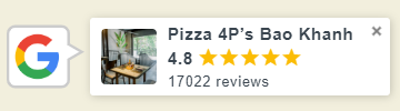
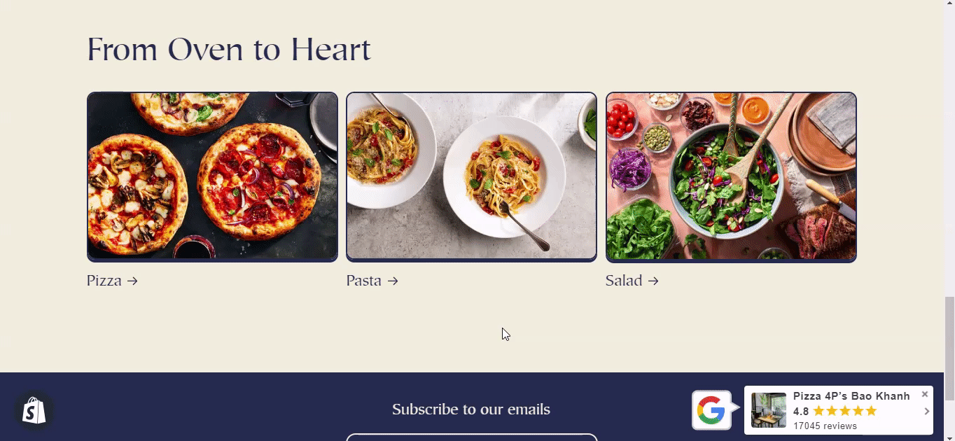
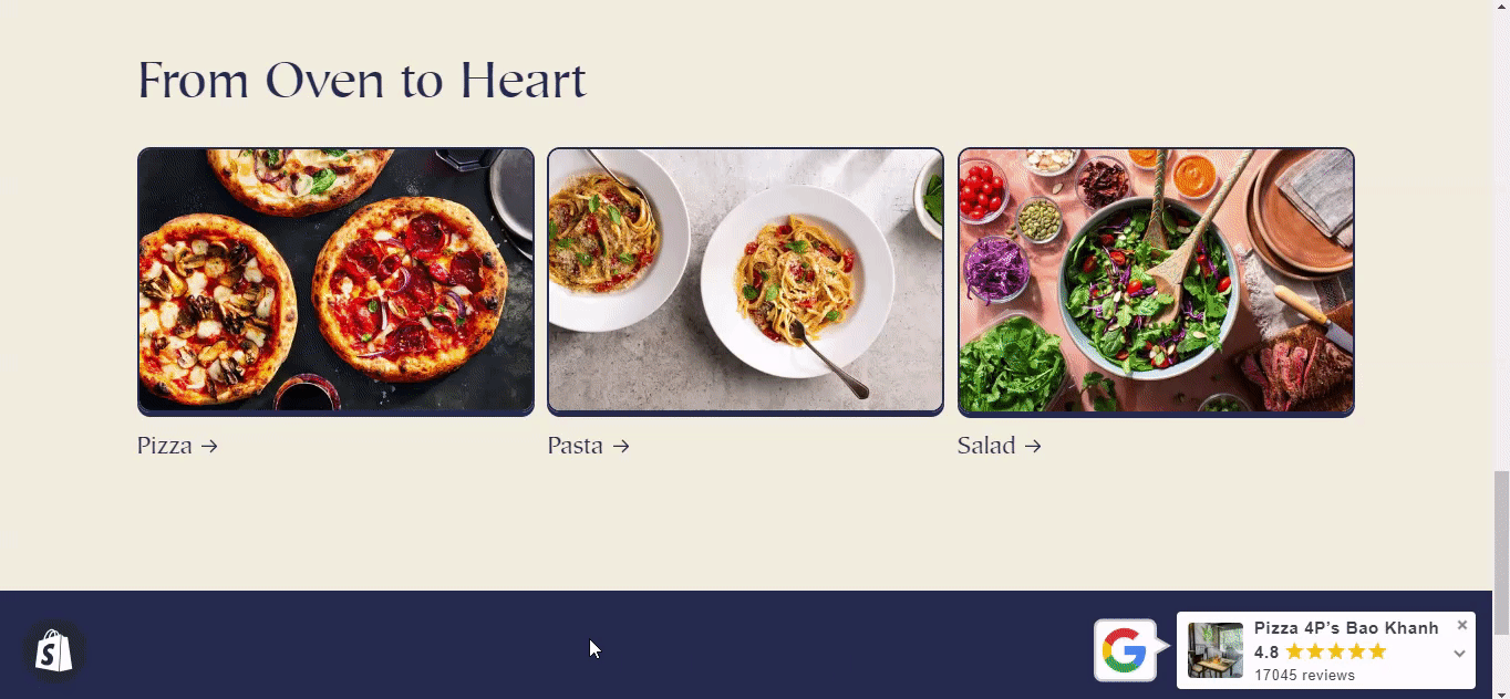
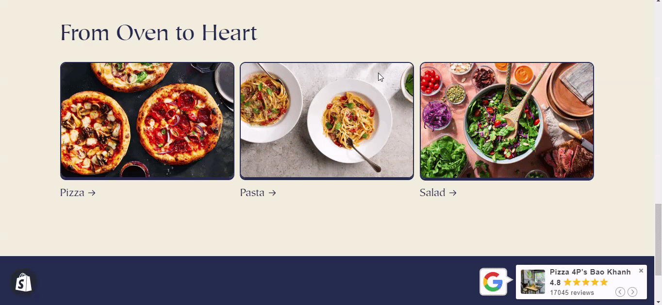
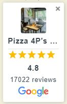
The horizontal card displays the store name, average rating, and total number of reviews. When enabled, the card will stay in a fixed horizontal position based on your specific alignment settings (left, center, or right). This ensures that the horizontal position remains anchored according to the set parameters even when the page is resized. When clicking on the tab, it will navigate to the store's Google reviews page.
Settings:
Location: The vertical alignment option allows you to position the card at the top, center, or bottom of the page.
Alignment: The horizontal alignment option allows you to position the card to the left, center, or right of the page.
Show Close Button: When this option is activated, a button (represented by an "X" icon) will appear in the top-right corner of the window or dialog box. Users can click this button to close or exit the displayed content.
Rounded corners: The corners of the card will appear rounded, with the degree of rounding depending on the radius value set. A higher radius value results in more rounded corners, while a lower value creates a subtle curve.
Background color: Adjust the background color of the card.
Text color: Adjust the text color.
Star color: Adjust the star color.
Anchor Popup 1
Display reviews without taking users away from the main page. When you click on the rating display card, a pop-up window will appear on the right side of the screen displaying all the reviews.
Settings:
Anchor
Location: The vertical alignment option allows you to position the card at the top, center, or bottom of the page.
Alignment: The horizontal alignment option allows you to position the card to the left, center, or right of the page.
Show Close Button: When this option is activated, a button (represented by an "X" icon) will appear in the top-right corner of the window or dialog box. Users can click this button to close or exit the displayed content.
Rounded corners: The corners of the card will appear rounded, with the degree of rounding depending on the radius value set. A higher radius value results in more rounded corners, while a lower value creates a subtle curve.
Background color: Adjust the background color of the card.
Text color: Adjust the text color.
Star color: Adjust the star color.
Business Summary Popup
Select show or hide Business Summary, Rating, Total review and Summary rating.
Rating Text: Customize rating words.
Background color: Adjust the background color of the business summary.
Text color: Adjust the text business summary color.
Body Popup
Background color: Adjust the background color of the reviews.
Text color: Adjust the text color reviews.
Content Max Line: Adjust the length of the reviews.
Reviewer: Select show or hide Avatar, Name & Detail, Date, Verified Badge, Review Photos, Show 'Like review'.
Leave a Review
Button: Select show or hide Leave a Review button.
Background color: Adjust the background color of the button.
Text color: Adjust the text color Leave a Review.
Anchor Popup 2
Display reviews without taking users away from the main page. When you click on the rating display card, a pop-up window will appear displaying all the reviews.
Settings:
Anchor
Location: The vertical alignment option allows you to position the card at the top, center, or bottom of the page.
Alignment: The horizontal alignment option allows you to position the card to the left, center, or right of the page.
Show Close Button: When this option is activated, a button (represented by an "X" icon) will appear in the top-right corner of the window or dialog box. Users can click this button to close or exit the displayed content.
Rounded corners: The corners of the card will appear rounded, with the degree of rounding depending on the radius value set. A higher radius value results in more rounded corners, while a lower value creates a subtle curve.
Background color: Adjust the background color of the card.
Text color: Adjust the text color.
Star color: Adjust the star color.
Business Summary Popup
Select show or hide Business Summary, Rating, Total review and Summary rating.
Rating Text: Customize rating words.
Background color: Adjust the background color of the business summary.
Text color: Adjust the text business summary color.
Body Popup
Background color: Adjust the background color of the reviews.
Text color: Adjust the text color reviews.
Content Max Line: Adjust the length of the reviews.
Reviewer: Select show or hide Avatar, Name & Detail, Date, Verified Badge, Review Photos, Show 'Like review'.
Leave a Review
Button: Select show or hide Leave a Review button.
Background color: Adjust the background color of the button.
Text color: Adjust the text color Leave a Review.
Anchor Slider 1
Ratings slide horizontally, allowing viewers to scroll through them smoothly.
Settings:
Location: The vertical alignment option allows you to position the card at the top, center, or bottom of the page.
Alignment: The horizontal alignment option allows you to position the card to the left, center, or right of the page.
Select show or hide Show Close Button, turn Auto Scroll on/off.
Slide delay: The amount of time a slide pauses before automatically transitioning to the next one.
Background color: Adjust the background color of the card.
Text color: Adjust the text color.
Star color: Adjust the star color.
Rounded corners: The corners of the card will appear rounded, with the degree of rounding depending on the radius value set. A higher radius value results in more rounded corners, while a lower value creates a subtle curve.
Anchor Slider 2
Ratings with review summary slide horizontally, allowing viewers to scroll through them.
Settings:
Location: The vertical alignment option allows you to position the card at the top, center, or bottom of the page.
Alignment: The horizontal alignment option allows you to position the card to the left, center, or right of the page.
Select show or hide Show Close Button, Auto scroll.
Slide delay: The amount of time a slide pauses before automatically transitioning to the next one.
Background color: Adjust the background color of the card.
Text color: Adjust the text color.
Star color: Adjust the star color.
Rounded corners: The corners of the card will appear rounded, with the degree of rounding depending on the radius value set. A higher radius value results in more rounded corners, while a lower value creates a subtle curve.
Anchor Vertical
The vertical card shows the store name, average rating, and total number of reviews. When clicking on the tab, it will navigate to the store's Google reviews page.
Settings:
Location: The vertical alignment option allows you to position the card at the top, center, or bottom of the page.
Alignment: The horizontal alignment option allows you to position the card to the left, center, or right of the page.
Show Close Button: When this option is activated, a button (represented by an "X" icon) will appear in the top-right corner of the window or dialog box. Users can click this button to close or exit the displayed content.
Background color: Adjust the background color of the card.
Text color: Adjust the text color.
Star color: Adjust the star color.
Rounded corners: The corners of the card will appear rounded, with the degree of rounding depending on the radius value set. A higher radius value results in more rounded corners, while a lower value creates a subtle curve.
Brick
This layout organizes the reviews in a staggered grid. Each review box varies in size that breaks away from the rigidity of traditional column layouts.

Settings:
Title: You can customize the title text and type.
Business Summary
Select show or hide Business Summary, Rating, Total review and Summary rating.
Rating Text: Customize rating words.
Background color: Adjust the background color of the business summary.
Text color: Adjust the text business summary color.
Card
Callout Layout: Option to include the reviewer's name and avatar within the review box.
Background color: Adjust the background color of the review box.
Text color: Adjust the text review color.
Star color: Adjust the star rating color.
Reviewer: Select show or hide Avatar, Name & Detail, Date, Verified Badge, Review Photos, Show 'Like review'.
Leave a Review
Button: Select show or hide Leave a Review button.
Background color: Adjust the background color of the button.
Text color: Adjust the text color Leave a Review.
Carousel 1
Multiple reviews are displayed in a rotating or sliding frame. Each slide displays 4 reviews. Summary rating is shown below the reviews, providing an overview of the average rating and the total number of reviews the store has received.
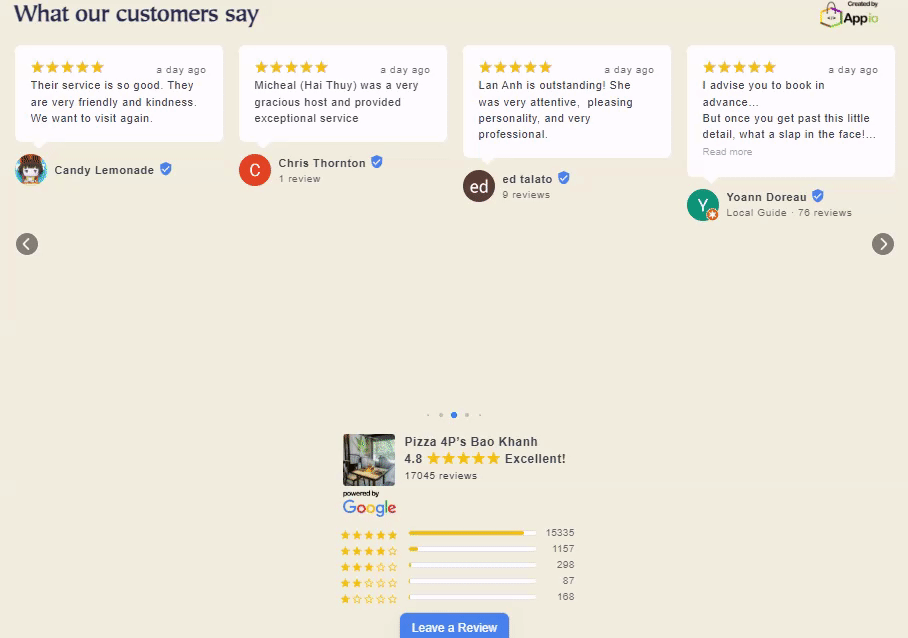
Settings
Title: You can customize the title text and type.
Card
Callout Layout: Option to include the reviewer's name and avatar within the review box.
Choose to turn Auto Scroll on/off, show/hide Navigation Bar.
Background color: Adjust the background color of the review box.
Text color: Adjust the text review color.
Star color: Adjust the star rating color.
Content Max Line: Adjust the length of the reviews.
Slide Delay: The amount of time a slide pauses before automatically transitioning to the next one.
Reviewer: Select show or hide Avatar, Name & Detail, Date, Verified Badge, Review Photos, Show 'Like review'.
Business Summary
Select show or hide Business Summary, Rating, Total review and Summary rating.
Rating Text: Customize rating words.
Text color: Adjust the text business summary color.
Leave a Review
Button: Select show or hide Leave a Review button.
Background color: Adjust the background color of the button.
Text color: Adjust the text color Leave a Review.
Carousel 2
Multiple reviews are displayed in a rotating or sliding frame. Each slide displays 3 reviews. Summary rating is shown to the left of the reviews.

Settings
Title: You can customize the title text and type.
Card
Callout Layout: Option to include the reviewer's name and avatar within the review box.
Choose to turn Auto Scroll on/off, show/hide Navigation Bar.
Background color: Adjust the background color of the review box.
Text color: Adjust the text review color.
Star color: Adjust the star rating color.
Content Max Line: Adjust the length of the reviews.
Slide Delay: The amount of time a slide pauses before automatically transitioning to the next one.
Reviewer: Select show or hide Avatar, Name & Detail, Date, Verified Badge, Review Photos, Show 'Like review'.
Business Summary
Select show or hide Business Summary, Rating, Total review and Summary rating.
Rating Text: Customize rating words.
Text color: Adjust the text business summary color.
Leave a Review
Button: Select show or hide Leave a Review button.
Background color: Adjust the background color of the button.
Text color: Adjust the text color Leave a Review.
Carousel 3
Multiple reviews are displayed in a rotating or sliding frame. Each slide will only display one review. Summary rating is shown above the reviews.

Settings:
Title: You can customize the title text and type.
Card
Choose to turn Auto Scroll on/off, show/hide Navigation Bar.
Background color: Adjust the background color of the review box.
Text color: Adjust the text review color.
Star color: Adjust the star rating color.
Content Max Line: Adjust the length of the reviews.
Slide Delay: The amount of time a slide pauses before automatically transitioning to the next one.
Reviewer: Select show or hide Avatar, Name & Detail, Date, Verified Badge, Review Photos, Show 'Like review'.
Business Summary
Select show or hide Business Summary, Rating, Total review and Summary rating.
Rating Text: Customize rating words.
Text color: Adjust the text business summary color.
Leave a Review
Button: Select show or hide Leave a Review button.
Background color: Adjust the background color of the button.
Text color: Adjust the text color Leave a Review.
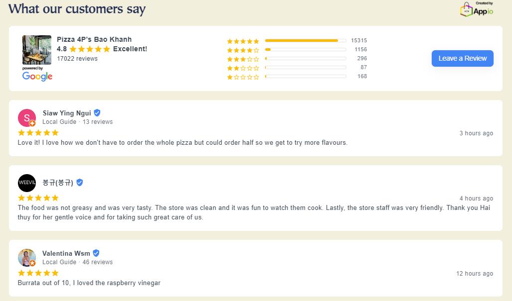
Grid
Reviews are neatly organized in a grid format in clear, evenly spaced columns, making them easy to read and browse quickly.

Settings
Title: You can customize the title text and type.
Business Summary
Select show or hide Business Summary, Rating, Total review and Summary rating.
Rating Text: Customize rating words.
Background color: Adjust the background business summary color.
Text color: Adjust the text business summary color.
Card
Callout Layout: Option to include the reviewer's name and avatar within the review box.
Background color: Adjust the background color of the review box.
Text color: Adjust the text review color.
Star color: Adjust the star rating color.
Content Max Line: Adjust the length of the reviews.
Reviewer: Select show or hide Avatar, Name & Detail, Date, Verified Badge, Review Photos, Show 'Like review'.
Leave a Review
Button: Select show or hide Leave a Review button.
Background color: Adjust the background color of the button.
Text color: Adjust the text color Leave a Review.
List
A straightforward list format displaying reviews one after the other, simplicity and clarity, making it easy to read through them in order.
Settings
Title: You can customize the title text and type.
Business Summary
Select show or hide Business Summary, Rating, Total review and Summary rating.
Rating Text: Customize rating words.
Background color: Adjust the background business summary color.
Text color: Adjust the text business summary color.
Card
Background color: Adjust the background color of the review box.
Text color: Adjust the text review color.
Star color: Adjust the star rating color.
Content Max Line: Adjust the length of the reviews.
Reviewer: Select show or hide Avatar, Name & Detail, Date, Verified Badge, Review Photos, Show 'Like review'.
Leave a Review
Button: Select show or hide Leave a Review button.
Background color: Adjust the background color of the button.
Text color: Adjust the text color Leave a Review.